GYRO
Designing a mobile application to reduce household food waste

This was a team project for the course, User Interface Design and Development. My 6-member team and I aimed to design a mobile application to help households reduce their food waste. We learned design methods such as contextual inquiry, affinity diagramming, personas, scenarios, and storyboards. We also created several prototypes of varying fidelity and used them to practice usability testing and heuristic evaluation. The outcome of this project was a functional mobile prototype.
- Time Period: Fall 2013
- Skills: design, research
- Collaborators: Pablo Arvizu, Euiyoung Kim, Sophia Lay, Ian MacFarland, and Suhaib Syed
- Final Deliverable: Functional Prototype
Contextual Inquiry
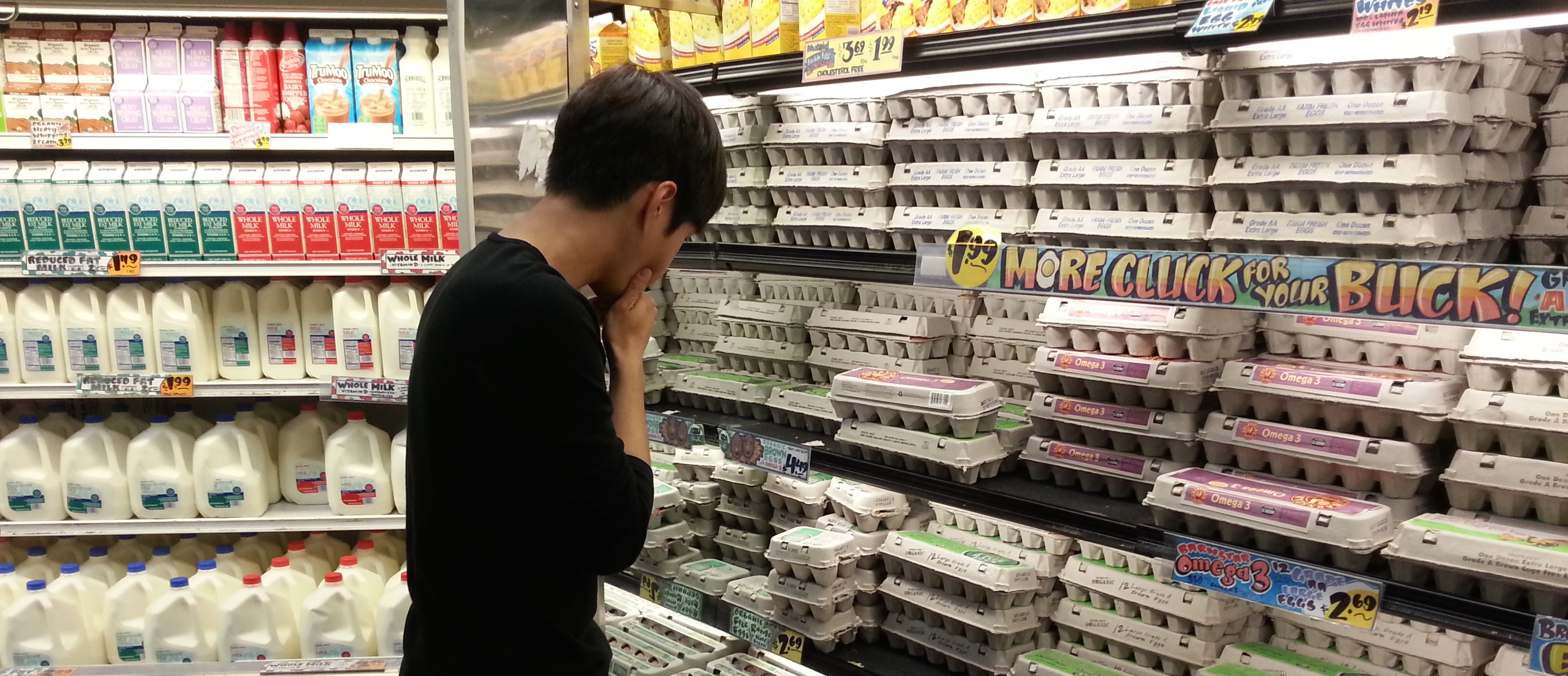
I participated in 3 of the 6 contextual inquiries we conducted to learn how users make food buying decisions at the grocery store. We observed how people use many different kinds of shopping lists (e.g, written, digital, mental lists), and how the quantities they buy are sensitive to budget, diet, and transportation.
Personas & Storyboards
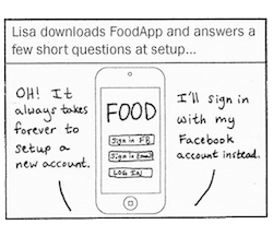
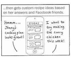
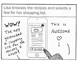
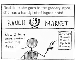
We created two primary personas based on our contextual inquiries. These personas were both busy graduate students, but with different levels of discipline and organization. My team created scenarios and storyboards based on these personas. Here are four of my storyboard panels.
Prototypes
A teammate and I made a paper prototype to explore the set up process for a recipe- and meal-focused prototype. We conducted “think aloud” user evaluations with this prototype and the other prototypes designed by the rest of our team.
After reviewing the results of the paper prototype evaluations, we reached a consensus on the approach for our next design. One team member made an interactive prototype with Axure based on the drawings by myself and other teammates.
After we conducted a heuristic evaluation of the interactive prototype with another team, we realized that we have drifted away from the core problem of food waste, and instead had designed another food inventory application.
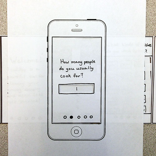
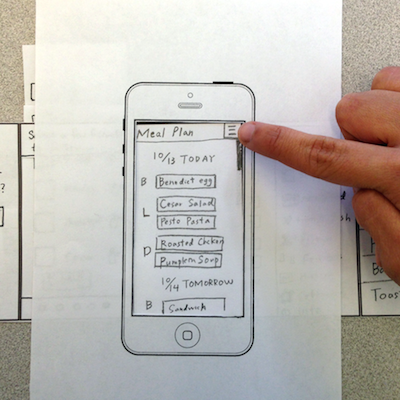
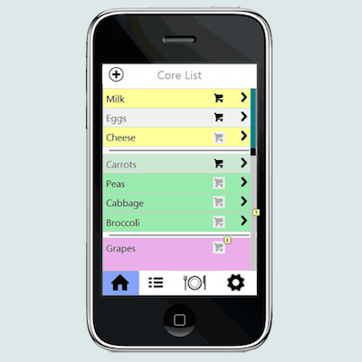
Left and Middle: Paper prototypes; Right: Interactive prototype
Project Pivot
Through discussion, we identified the core variables of the food waste equation to be food and time. With two weeks before the final deadline, we decided to scrap the earlier shopping list and food inventory ideas, and instead design a simple set of timers to display that information.
Functional Prototype
I created mockups of our new idea with Adobe Illustrator and two teammates built the functional prototype. We then conducted usability tests on the basic functions of creating, editing, resetting, and deleting a timer. The testing provided us with invaluable feedback on how to improve the design of the app, and how the app could be more widely used for non-food reminders.
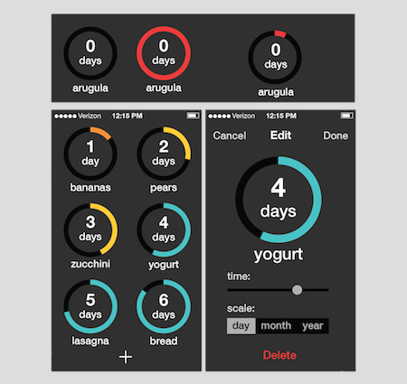
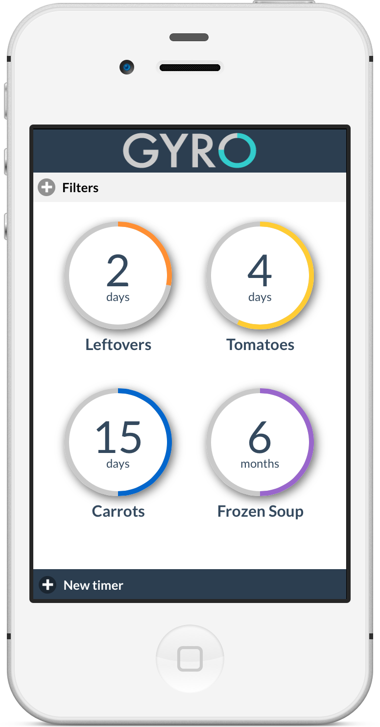
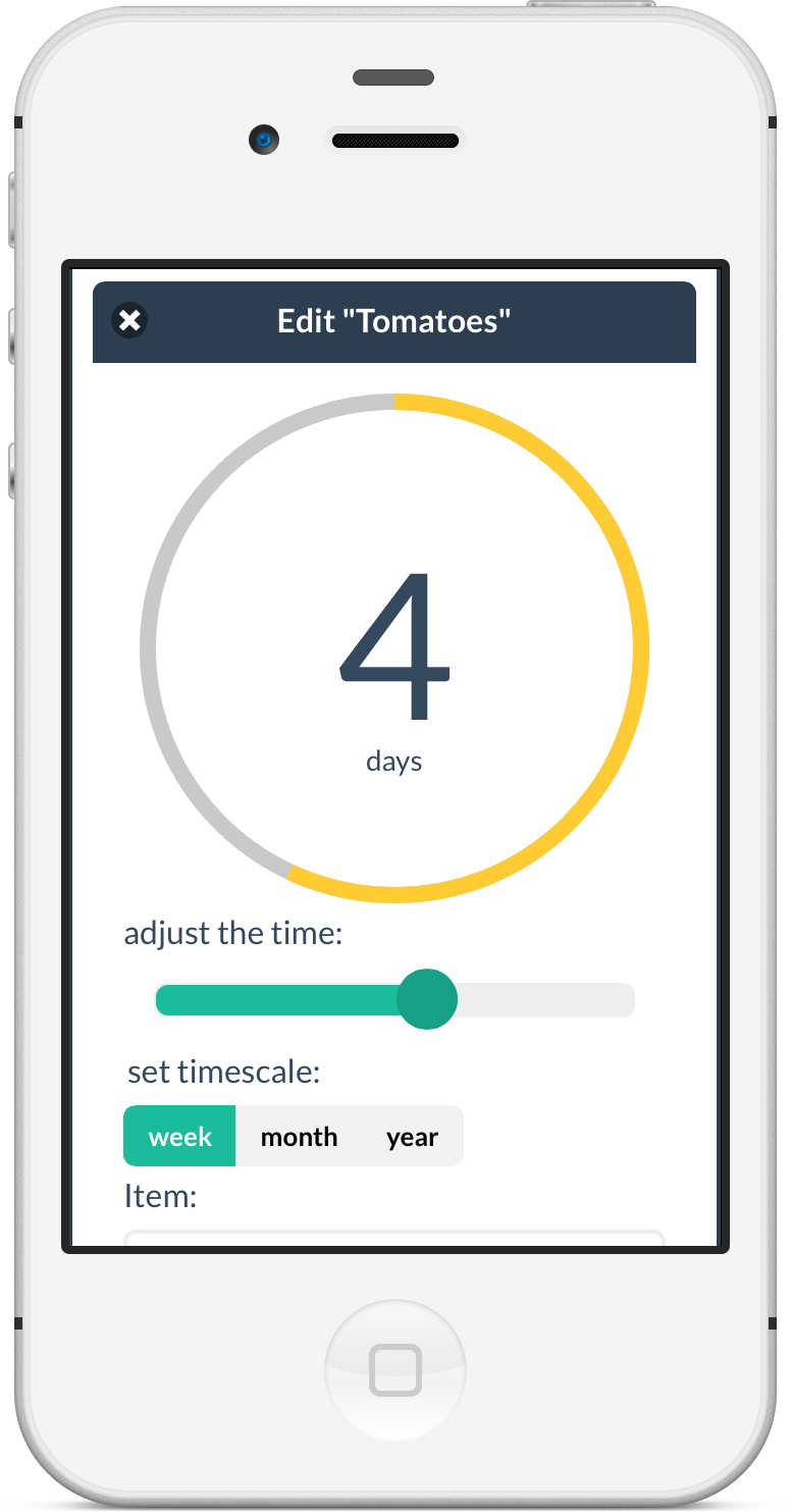
Left: Mockups of early visual design concept; Middle and Right: Screens of the final functional prototype